Eye-tracking study brings new insights into the user friendliness of mediatheques
Navigation strategies preferred by users were able to be established for the three mediatheques at DasErste.de, WDR.de and ZDF.de investigated as examples. Mediatheque navigation concepts are to be designed around these.
According to the eye-tracking study made by Düsseldorf UAS, there is potential for optimisation with regard to some usability rules (user friendliness), such as navigation and clear structuring. For example, a visually recognisable separation of individual video content is often lacking. The multifarious ways of access offered by the broadcasters, however, meets the requirements of users for multiple options of sorting the content: chronological (94%), by subject (72%) and by region (63%). Recommendations made by the editors, in contrast, were only valued 6 per cent of the guinea pigs polled.
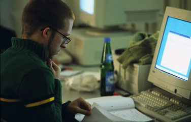
In the usability study performed by the Communications Research Body at the Faculty of Business, 32 guinea pigs were asked to search for videos and answer specific questions. The majority of the guinea pigs deployed the global navigation systems provided by the respective broadcaster's Web site to find the videos they were looking for. Other users looked for the video content via the search function. In contrast, very few users deployed the direct call-up of the mediatheque concerned as a navigation strategy.
The researchers gave several recommendations for action. "The vertical navigation structure, as known from numerous Web sites, is also recommendable for mediatheques" is the conclusion that Sebastian Goldstein, a member of the research body's scientific staff, draws from the study. When using the horizontal navigation structure of one of the three mediatheques invested, numerous orientation problems were able to be determined amongst the guinea pigs on the basis of a replay analysis.
Due to the parallel use of text and audio-visual content in part, a visible integration of additional text information should also be preferred by mediatheques, instead of an onward link. User-controlled activation of a video is better than an automatic start by the video player. In addition, search functions are not always intuitive, the quality and presentation of the search results could be optimised. Thumbnail images should refer to individual broadcasts or reports in most meaningful manner possible, repeated generic images mean a loss of information for mediatheque users. "A clear visual separation of the individual information units, such as the reports in a broadcast, should be aimed for - by observing the law of proximity, using meaningful headers and ensuring a high contrast between the text and the background", recommends project worker Carina Bischoff.
"Institutions and enterprises which want to integrate video material on their Web sites should thus always bear user friendliness in mind", says Prof. Dr. Sven Pagel, spokesman for the Communications Research Body at Düsseldorf University of Applied Sciences, flying the flag for user-oriented video communication on the Web.
The results were presented at the "Workshop for audio-visual media" in Chemnitz. An abridged version of the study appeared in the proceedings of the event. The team of authors headed by Prof. Dr. Sven Pagel also consists of Carina Bischoff, Sebastian Goldstein and Alexander Jürgens. Students on the "Communications, Multimedia and Market Management" Master course helped to prepare the research design.
